
Today I wanted to write about how the cover of Enemies of Doves came to be. A really cool benefit of working with a smaller publisher is that you get a lot of input on your cover art. I have a friend who is published with one of the big five publishers and he got his cover in an email one day that said, “Here’s your cover. Have a nice weekend.” That is probably not the norm, but the fact is anytime you sign with ANY publisher, you give up a lot of control of your book, and this is hard for a control freak like me. One thing I didn’t want to give up was being a part of the cover design.
My publisher was kind enough to allow me to run a contest on a site called 99 Designs. With 99 Designs you pay a flat fee and numerous designers submit cover designs. You go through a week-long process of feedback and eliminations until you select the design you want. That designer is then paid a percentage of the fee that you paid to run the contest. The price ranges greatly, but I chose mid-range. You submit a brief about your book and any design ideas you have. Within hours the designs start rolling in.
I was really blown away by the quality of designs and by how difficult it was to select a winner. When all was said and done, I received 131 designs. Many of these were variations of my favorite designs that I asked for tweaks on. More on that to come, but about 75 of that 131 were unique design ideas.
After I declined certain designs, the designer is allowed to withdraw it from the competition. A majority understandably did just that, so there are many designs I can’t show you including three of my top five, but I will post a few of my favorites that were not withdrawn.
The first day resulted in many great designs, but these two were my favorites. They were created by a designer named Ladybird.
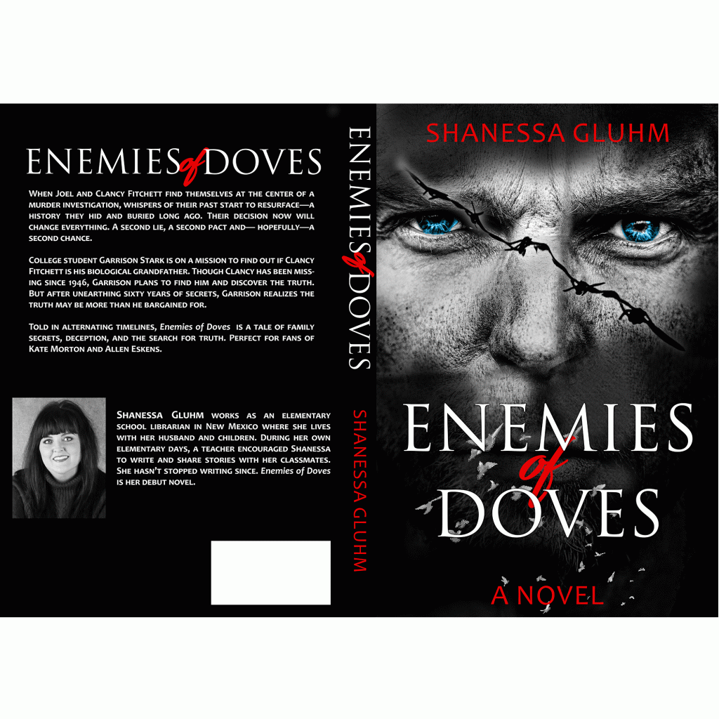

I loved the black cover and the contrast of the red font on both covers. I originally thought I didn’t want any faces or characters on the cover, but I loved the barbed wire scar and how it almost looked like two different faces. I knew then I’d made a good decision in running this contest. I was liking design ideas that I never thought I would.
The following day, many additional designs came in that I liked including this one by CirceCorp.

It was a stark contrast to my favorites the day before, with light colors and a more peaceful feel, but it reminded me of a cover of a Kate Morton book. Since I feel our books are very similar in plot and structure, I felt this would appeal to the right audience.
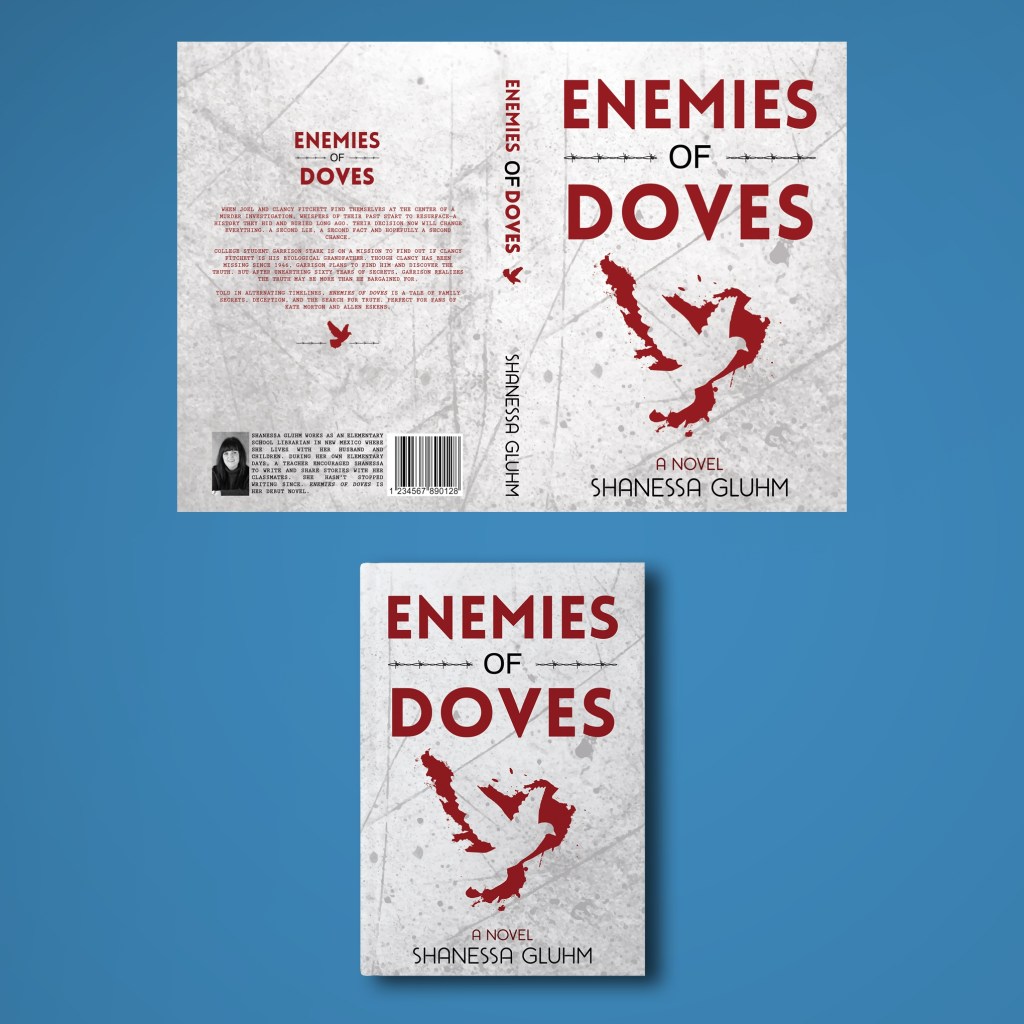
The two designs below are by mob23. The cover on the left was the original. I loved it but wondered if the dove in the blood was too abstract. Because I know how much work graphic design is, I tried not to ask designers for many changes until I was serious about taking them into the finals, but I did ask this one to show me an idea with a less abstract dove. In the end, I was impressed with both versions.

Around day 3, a designer named named Dimitar Stanchev (mslmisko) submitted a few ideas.

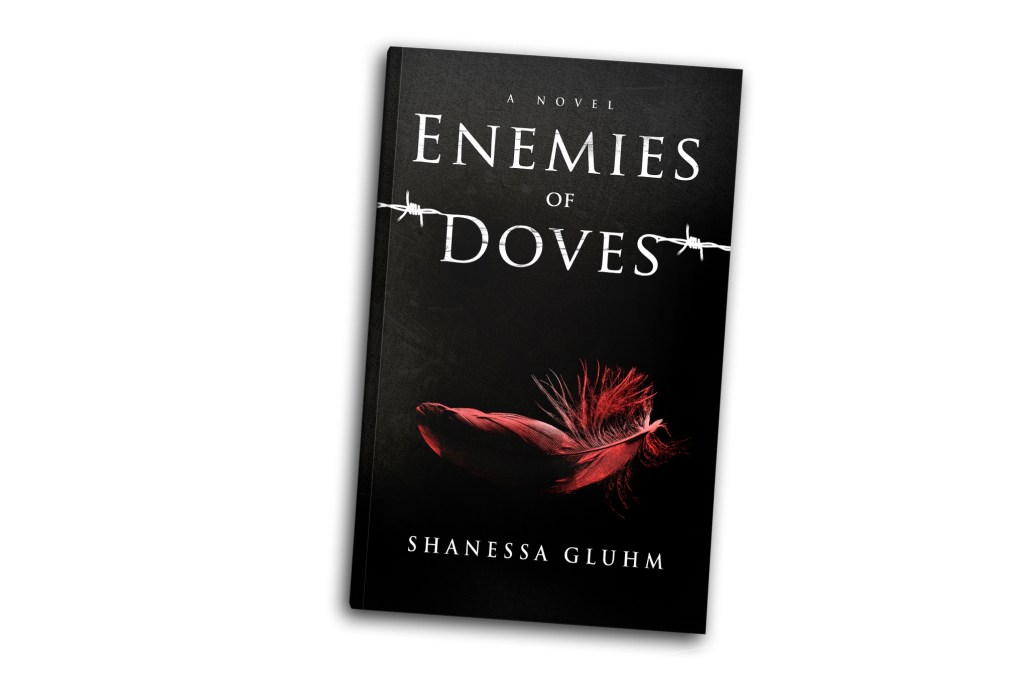
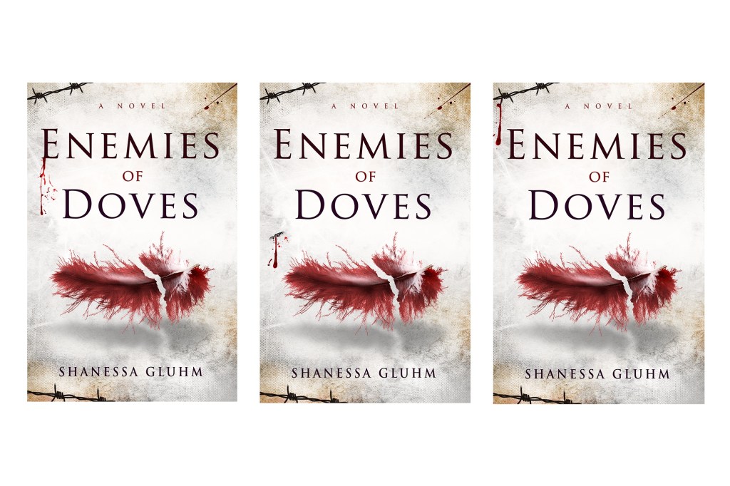
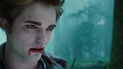
If you’ve seen my book at all, you probably recognize these designs. 🤩 Though I really loved the black cover and barbed wire on the design on the right, I worried it was a little too Twilight-ish. I mean, I was a Twilight fan with the best of them back in the day, but that’s not the vibe of my book. I loved the broken feather on the cover on the left. The break in it reminded me of a scar, and I knew right away this would be one to beat! I told this designer he was definitely on the right track. I gave him a few ideas, and he had some of his own to improve the design. He sent in many variations including lightening the cover and making the scar effect more prominent. It was getting closer and by mid-week, I was just about positive he would win.
On 99 Designs, you can look through various designers’ portfolios and request they enter your contest. A fellow writer at TouchPoint Press, who also used 99 designs, has a beautiful cover created by a designer named Estella. On day one of the contest I’d written her asking if she’d enter my contest. Just when I was sure I’d decided on a winner, she entered her designs and made me second guess everything.


I loved these designs. LOVED THEM. Even as I look at them now, a part of me wonders if I should have chosen her. I loved the simplicity of the design and especially the blood splatters. Though I loved them both, the darker one was my favorite. I loved how there was barely visible blood in the black sections of the cover and the font with red rising in it. This cover reminds me of a very pivotal scene in my book, and because of that I developed an instant emotional attachment to this design.
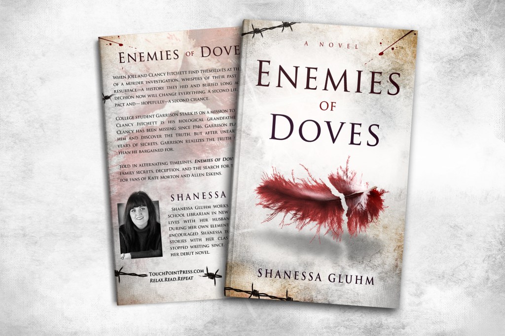
Meanwhile the designer of the broken feather cover was still making alterations in the small details. He had added depth to the feather, which was my husband’s idea, and designed a back cover. The finished product was beautiful!

BUT…. I just couldn’t stop thinking about the other cover so I asked Dimitar to taint his beautiful cover by somehow working in blood. I’m sure he thought I was crazy, but I needed blood!

So he went back to work. He attempted probably twenty different ways of putting blood on the cover but none were working for either of us.
Yet he was undeterred and vowed to keep at it.


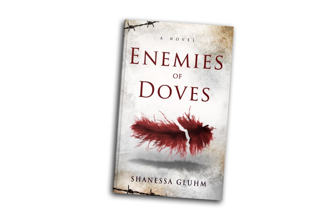
Nope, still not working. My husband kept telling me blood just wasn’t going to fit with this design, and if I wanted blood to pick the other one. I was seriously about to when I noticed the blood splatter on the back of the cover on the above left. I liked the hint of it and wondered if it could be carried over to the front as well. Like the book happened to be sitting nearby and got just a touch of blood on it. He delivered.
I was thrilled with the result. I had the best of both worlds, a beautiful cover, yet my thirst for blood was satisfied.
I almost ended the contest early at the point and awarded broken feather cover the winner, but I still couldn’t let go of the other design. Then, of course, with one day to go, I got another design in that I LOVED. The first time I saw it, I said, “This is it.” I emailed it to my best friend, who had walked every step of the contest with me, and she said, “This is the one.” I can’t post it unfortunately because the designer withdrew it, but it was fabulous. I was, for one day, convinced that he had come out from nowhere to win.
But…I’m wishy-washy and could not decide between these three designs. I totally get how the Bachelor feels because you do love them all.

I decided to enlist the help of my friends. I made a collage with the top three and sent it out for feedback. Opinions were as all over the place as my own and there was no clear winner. Thanks for nothing, guys! 😉
When the entry deadline ended, I stared at the three pictures side by side until my eyes crossed. Oddly enough, the last-minute entry I had thought won became my third place. Easy come, easy go. (I obviously have commitment issues). Now I was back to blood splatter vs. broken feather.
On the night before I had to choose a winner, I went to bed but could not sleep, feathers and blood dancing in my head. I couldn’t stand it any longer and got out of bed at midnight, fired up my computer, and looked at the two designs one final time. Even though I loved them both, ultimately the broken feather just kept drawing my eye to it more, so I declared it the winner. I received the final files and submitted them to my publisher for approval.
The next morning I woke up and thought, What have I done? I should have waited. I should have agonized all day today before making my decision. What if I made a terrible mistake?

Luckily, I got an email from my publisher, confirming what I already knew deep down, that my cover was perfect. I felt glad I’d chosen Dimitar’s design after the many, many alternations he’d made for me. He was truly amazing to work with, and I’d do it again in a second. The cover is even more beautiful in person, and I’ve received so many compliments from readers who say the cover is what made them pick up the book. Who says you can’t judge a book by it’s cover?
In the end, I couldn’t be happier with the 99 Designs process. It can be pricey, but like in all things, you get what you pay for. Plus you are getting so many design ideas for the price. Their set up is brilliant, their designers talented and their support team top notch. Who knows what’s in store for my second book, but given the opportunity I’d love to run a cover contest again.
